久々の更新となります。Elementor好きのえれくりです。?
今回は画像カルーセルウィジェットを使って、PCとスマホで画像の見せ方を変える方法を説明します。??
このページ下のDEMOを見ていただくと
●PC、タブレットでは画像を横に3つ
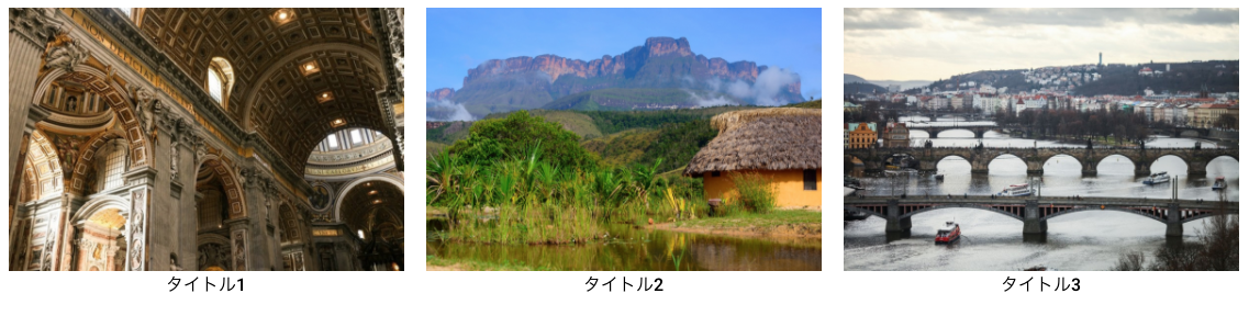
●スマホ環境ではカルーセルで画像を表示。

の表示を確認できます。普通に画像カルーセルウィジェットを使用した場合、PCもスマホもカルーセル表示となると思いますが、今回のDEMOのように少し趣向を変えたい場合の方法を説明します。
はじめに
 まずはじめに左パネルより画像カルーセルウィジェットをドラッグ&ドロップします。
PC、タブレットの場合
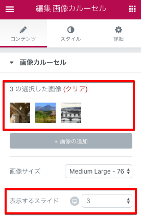 適当な画像を3つ追加します。表示するスライドを3とします。デスクトップアイコンをクリックしてタブレットも表示するスライドを3とします。
スマホの場合
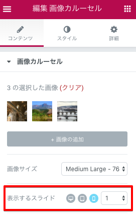 続いて、表示するスライドのPCアイコンをクリックしてモバイルアイコンをクリックします。そしてプルダウンメニューより1を選択します。
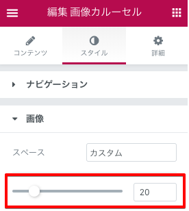
このままだと画像と画像の間が詰まっているのでスタイルタブより、画像のスペースを20pxにします。
あとがき
Elementorの使い方に慣れてくると、少し変わった表示の仕方をやってみたくなります。
設定を色々弄るとまだまだ違う見せ方が出来るのでぜひぜひトライしてみてくださいー??

