レスポンシブに対応したメニューを作るのって少し手間かかりますよね。???
ElementorのNav Menuウィジェットを使えば
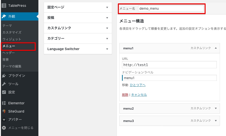
WordPress管理画面>外観>メニュー
で作成したメニューを使ってElementor内にメニューを作成できます。
では紹介します!?
はじめに
 左パネルのPRO ELEMENTSのNav Menuウィジェットを「新しいセクションに追加」へドラッグ&ドロップ。
WordPress管理画面>外観>メニューで作成したメニューが表示されます。
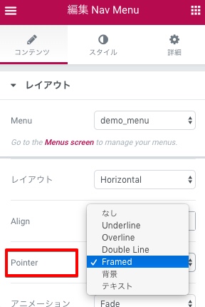
メニューを切り替えたい場合、左のコンテンツエリアのMenuから切り替えることが出来ます。
Pointer
Pointerとはメニューにロールオーバーした時の処理。
DEMO見た方が早いと思うので何種類か設定してみました。
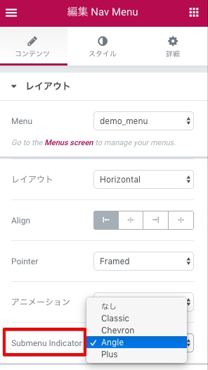
Submenu Indicator
Submenu Indicatorとはサブメニューの横に表示するアイコンのこと。
こちらもDEMO見た方が早いと思うので何種類か設定してみました。
Breakpoint タブレット、モバイルでの切り替え
左コンテンツエリアのBreakpointでメニューで表示を切り替えるデバイスを指定できます。
モバイル時のアイコンは の表示になりタップするとメニューが表示されます。
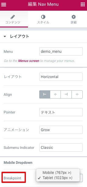
Mobile(767px >)に設定した場合
デスクトップ:通常メニュー
タブレット :通常メニュー
モバイル :モバイルアイコン
Tablet(1023px >)に設定した場合
デスクトップ:通常メニュー
タブレット :モバイルアイコン
モバイル :モバイルアイコン
あとがき
今までAdobe DreamweaverやBoostrapを使ってグローバルメニューのコーディング制作するときにあぁ面倒臭いいぃと作業してたのがNav Menuウィジェットを使うことで素早く実装でき時間短縮されるので他のデザインに時間をかけることが出来ますねっ。?