画像ギャラリーをスマホでも3カラムで表示したいっ

Facebook
Twitter

ひさびさの投稿となりますっ。えれくりです!

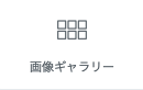
さて今回は画像ギャラリーウィジェットのことです。

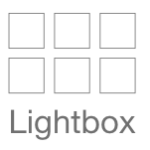
ウィジェットをドラッグしてこのように、ええ感じで画像を並べてクリックするとLightboxで表示されて「やったー出来たー」という気分になりたいところですが。。

スマホで見た時に1カラムで縦に並んでしまいます。うーむこれをPC同様に横3カラムで表示させましょう。2019/3/13現在のプラグインのバージョンではデバイス毎のカラム変更ができないようなのでcssで変更したいと思います。

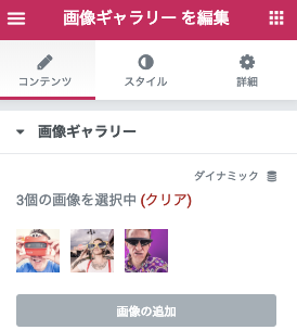
画像ギャラリーウィジェットの編集>Custom CSSの箇所にこちらを入れます。

横4カラム表示したい場合は25%、3カラム表示は33%、2カラム表示したい場合は50%。

いずれElementorのプラグインバージョンあがったらさくっと解決できると思いますが。。w

@media screen and (max-width: 766px) {

    .gallery-item {
        max-width: 33% !important;
    }
    
}

画像ギャラリー

検索
Elementorカテゴリ
Sponsored Links

Announce

New
arrival

2019 collection

Let’s face it, no look is really complete without the right finishes. Not to the best of standards, anyway (just tellin’ it like it is, babe). Upgrading your shoe game. Platforms, stilettos, wedges, mules, boots—stretch those legs next time you head out, then rock sliders, sneakers, and flats when it’s time to chill.