ナビメニューウィジェットをステージに追加すると

このようにハンバーガーメニューがスマホの時に表示されます。

これだけだとメニューだと分からない人もいるため
三本線の上に「MENU」とテキストを表示させたいと思います。

ナビメニューウィジェットの詳細>カスタムCSSへ以下を入れます。

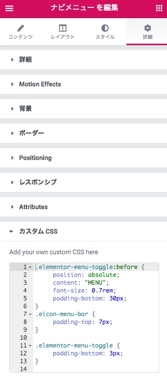
.elementor-menu-toggle:before {
position: absolute;
content: “MENU”;
font-size: 0.7rem;
padding-bottom: 30px;
}
.eicon-menu-bar {
padding-top: 7px;
}

.elementor-menu-toggle {
padding-bottom: 3px;
}

そして微調整をおこないます。
スタイルタブのToggle Buttonのサイズを30ぐらいにします。


するとどうでしょう〜MENUが表示されたじゃありませんか( ^ ‿ ^)/
これでメニューかどうか分からんとは言わせんぞー

↓スマホで見てみてください。

デモを見る

Announce

New
arrival

2019 collection

Let’s face it, no look is really complete without the right finishes. Not to the best of standards, anyway (just tellin’ it like it is, babe). Upgrading your shoe game. Platforms, stilettos, wedges, mules, boots—stretch those legs next time you head out, then rock sliders, sneakers, and flats when it’s time to chill.