自由配置できるフレキシブルレイアウト

Facebook
Twitter

Elementor V2.5になってフレキシブルレイアウトが使えるようになりました!
これは凄い。超絶便利です。
Elementor依存度MAXですw。もうDreamweaverに戻れない。。

フレキシブルレイアウト(Flexible Layout)を使用すると直感的にレイアウト調整を行うことができます。

といってもよくわからないのでまずは作ってみましょう。

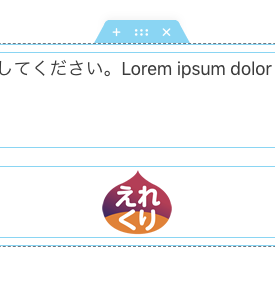
画像を入れるとわかりやすいので、画像ウィジェットより適当な画像を入れます。

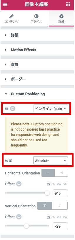
画像ウィジェットの画像を編集>詳細タブ>Custom Positioningを選択。

幅:インライン(auto)

位置:Absolute(絶対位置)

にします。これで画像ウィジェットを思いのままに配置することができます!

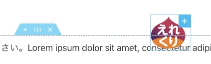
要素の右上が十字カーソルになるので、ドラッグしてステージ上の自由な位置に移動できます。

左下のレスポンシブモードでタブレット、モバイルの調整をそれぞれおこなえます。

※位置をAbsoluteやFixedにしたときにPlease Note!と表示されますね。

「レスポンシブWebデザインのベストプラクティスではなく頻繁に使用しないでね〜」と書いてますが便利なので使っちゃいます。。

https://elecre.net/flexible-layout/

検索
Elementorカテゴリ
Sponsored Links

Announce

New
arrival

2019 collection

Let’s face it, no look is really complete without the right finishes. Not to the best of standards, anyway (just tellin’ it like it is, babe). Upgrading your shoe game. Platforms, stilettos, wedges, mules, boots—stretch those legs next time you head out, then rock sliders, sneakers, and flats when it’s time to chill.