Elementor iPhone,iPadで見た時に隠す!

Facebook
Twitter

さて今回はモバイルで見た時に要素を隠す!です。

PCで見た時は図のように画像とテキストを表示していますが

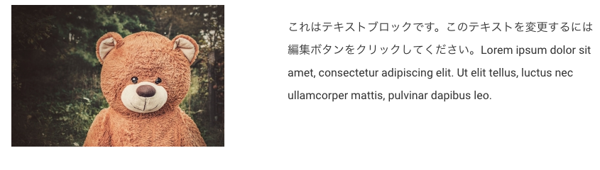
モバイルで見た時にテキストだけにしたい場合、

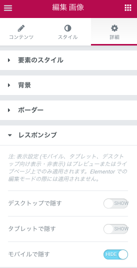
画像ウィジェトを選択して左の詳細タブより

レスポンシブ>モバイルで隠す>HIDE

にするとモバイル(iPhone or Androidなど)で見た時に画像ウィジェットが非表示になります。??

※タブレットで非表示にしたい場合も可能です。

ちなみにelementor編集上で左下のモバイルモードにしても変化はありませんブラウザもしきはスマホ実機でご確認ください。
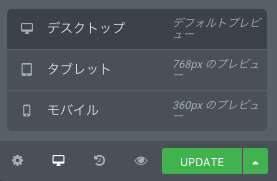
↑を選択しても非表示になりません。

ブラウザでモバイルまたはタブレットの状態を確認したい場合

以下それぞれのブラウザで確認できますが要所要所で実機でも確認をしておいた方が良いです。?
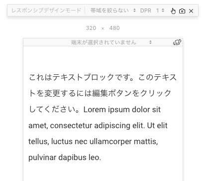
Safariの場合

Safari>Safari>開発メニュー>レスポンシブ・デザイン・モード

にすると図のような画面になり異なる環境の表示チェックもおこなえます。

※開発メニューを出したい場合は、
環境設定>詳細>メニューバーに”開発”メニューを表示 にチェックっ!
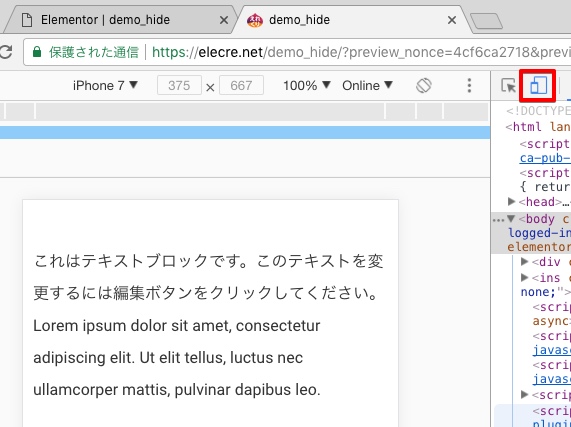
Chromeの場合

Chrome>表示メニュー>開発/管理>デベロッパー ツールよりToggle Device Toolbar

をチェック!

Firefoxの場合

Firefox>ツールメニュー>ウェブ開発>レスポンシブデザインモード

をチェック!

DEMO

検索
Elementorカテゴリ
Sponsored Links

Announce

New
arrival

2019 collection

Let’s face it, no look is really complete without the right finishes. Not to the best of standards, anyway (just tellin’ it like it is, babe). Upgrading your shoe game. Platforms, stilettos, wedges, mules, boots—stretch those legs next time you head out, then rock sliders, sneakers, and flats when it’s time to chill.